

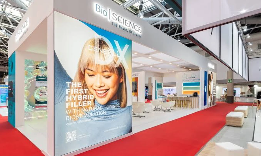
Exhibitors frequently assume that the way to be noticed in a crowded hall is to be bigger, brighter and louder than the neighbours. Since every neighbour reasons the same way, the result is a hall of stands competing at the same pitch, in which none is distinct. Effective exhibition booth design singapore work takes the opposite route: it decides on one thing a visitor should understand from the aisle and removes whatever does not serve that, so that clarity, not volume, does the work.
One Message, Readable in Seconds
A visitor walking the aisle gives each stand only a glance. In that time they should learn who the exhibitor is and what problem it solves. That calls for a short statement in large type at high level, not a list of products or a paragraph of corporate values. Testing the main graphic by showing it briefly to someone unfamiliar with the company is a simple way to find out whether the message survives. If they cannot repeat it, the wording needs to be shorter, not the type larger.
Using Height and Sightlines
What can be seen from across the hall is decided by height. A high-level sign, a tall feature wall or a suspended banner, where the organiser’s rules and the venue’s rigging points allow, identifies the stand from a distance. Closer in, the view from each approaching aisle matters: walk the floor plan and note what a visitor will see first from every direction, then place the key message and the best product there.
An Open Edge That Invites Entry
Stands that present a counter or a wall to the aisle keep people out. An open perimeter with a level floor, or a gentle ramp where a platform is unavoidable, lets visitors drift in without feeling committed. Staff positions matter as much as structure; a row of people standing at the edge acts as a barrier. Placing something of interest a few steps inside draws visitors across the threshold naturally.
Learning From Stands That Worked
Before settling a design, study what has succeeded in comparable halls and for comparable products. Photographs of finished stands show how a concept copes with real lighting, crowds and neighbouring structures in ways a rendering cannot. Reviewing a contractor’s completed exhibition and event projects also reveals the standard of finish that can be expected, how graphics are integrated with structure, and whether the firm has handled stands of the size being planned.
Lighting That Separates You From the Hall
General hall lighting is bright and shadowless, which flattens everything beneath it. A stand that adds its own layer, with spotlights on products, illuminated graphics and perhaps a lower, warmer level in a meeting area, appears as a distinct place. Avoid glare at eye level and screens washed out by spotlights. Lighting is among the cheapest ways to raise the perceived quality of a stand, yet it is often cut first.
Demonstration as the Centrepiece
Movement attracts attention more reliably than any static display. A working machine, a live preparation, a short timed presentation or a hands-on trial gives passers-by a reason to stop and gives staff an opening line. The demonstration needs a planned position, visible from the aisle but not blocking it, with space for a small audience. Organisers set limits on noise and on encroaching into the gangway, which should be checked beforehand.
Graphics With Hierarchy
Too many stands treat every surface as an opportunity for text. A clear hierarchy works better: one headline at high level for distance, a second tier of short benefit statements at eye level for those nearby, and detail reserved for literature, screens or conversation. Images should be large and few. Check the resolution of artwork at full size, because a blurred picture several metres wide undermines an otherwise careful stand.
Space for Conversation
The purpose of most exhibitions is to talk to prospective customers, and that needs somewhere suitable. Standing-height tables near the edge suit quick enquiries; a semi-enclosed area with seating suits longer discussions. Storage for bags, literature and refreshments should be concealed so that the stand stays tidy. Allow enough clear floor for visitors to stand without feeling crowded, even if that means showing fewer products. A stand that feels calm encourages longer and more useful discussions.
Reuse and Responsible Materials
A stand built for one show and discarded is expensive and increasingly hard to justify. Modular frames, fabric graphics that can be reprinted, hired furniture and reusable lighting allow the same investment to serve several events with a changed appearance. Ask the designer how the stand will pack down, where it will be stored and what could be adapted to a different floor size, as stand spaces are rarely identical. Hired components should be weighed against the cost of owning and storing them.
Choosing a Direction for Your Stand
Start from the single message, then spend on the elements that carry it: height, lighting and one strong demonstration. Cut decorative features that do not help a visitor understand or stay. Submit drawings to the organiser in good time and keep a little budget for adjustments on site. Where the product is best understood by taking part, consider borrowing methods from immersive themed environments, which plan a visitor’s whole sequence of actions and not only the view.